As the ever-charming and eloquent Gaston from the Disney classic Beauty and the Beast stated in his highly insightful quote that inspired my title, people really tend to be drawn to books that are illustrated. Not necessarily filled with more drawings than words, like children's books, but those with at least the occasional illustration to augment the content of the novels. While Champion does not have images interspersed throughout its text, it does have a lovely illustration at the very beginning before the story itself starts.
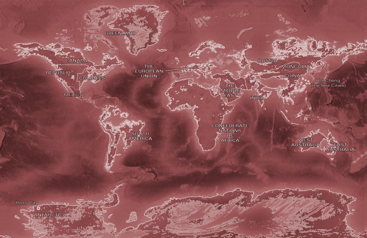
Bear in mind that Champion is a dystopian society novel, so, as most of those are, it is set in the future. Due to this passage of time, the earth has drastically changed, and so have the countries it houses. The illustration at the beginning of the book depicts a detailed map of the earth in its current state of affairs at the time of the storyline.
One of the first things that stands out in this image is the fact that much of the land in the world has been flooded, leaving less area on each of the contents. Aside from this, the only alteration made in comparison to the modern map is the labeling on the countries, which very obviously differ from the world as we know it.
In the book itself, the only information given about this piece of art is that the "Map Illustration" was done "by Peter Bollinger". That's it, no further elaboration given upon who he is or the technique he used. However, upon quickly typing his name into Google, I found that he is an award-winning digital artist who excels both in 2D and 3D works. So, as I would already have inferred just by looking at the style of the artwork, the map was rendered on the computer, probably in Adobe Illustrator or Photoshop. I was oddly unable to find any specific information that was directly related to his work on this project, though. All searches simple reaffirmed the fact that he did create this illustration, but that's apparently all that was deemed to be relevant.
Upon further thinking, though, I became curious as to why exactly it is that we as humans are so drawn to images in our literature. Then I thought back to middle school when we were given tests on how we learned best. I recalled how nearly everyone I knew was primarily, or at least partially a visual learning. I then went to Google to inquire into the exact percentage of the population consists of visual learners, and an entry from the Pearson Prentice Hall popped up, informing me that it's over 65 percent. This would easily explain why people enjoy illustrations to fill the pages of their reading material.
However, while this book does not contain a plethora of notable imagery, such as the many well-known pieces of woodcut art in Alice in Wonderland, the art still serves a purpose that is just as relevant, as this map adds greatly to the realism of the work and the extent to which the reader can feel immersed. It is extremely convenient to flip back to the beginning to view this map, or, even if it is only glanced over once, it still offers a visual reference for what the world Lu has created is like. Plus, regardless of the content, it's simply well-designed and assimilates well with the typography and color of the rest of the book, further adding to this specific novel's beauty.
One of the most interesting things that you can study about a book is it's provenance, or it's origin and history. My specific book for this class, as I addressed in the previous post, doesn't have much to offer in this department, as it was published in 2013, when I purchased it. Again, the only mark on it is a hot chocolate spill. Though the story behind that is fairly interesting. I was home over winter break and suddenly had a craving for hot chocolate due to the fact that it was -30 degrees with the windchill and I'd just had to go on a trip to get salt for our front walk. However, we had no hot chocolate mix. We also had no cocoa powder. And we had no chocolate syrup. So I was forced to scrounge up some chocolate chips and attempt to melt them into some milk to make hot chocolate. It turned out surprisingly well, actually. But I still spilled a little on the outside of my book. So now I will forever remember my culinary endeavors this past winter.

My interactions with books are not also so devoid of provenance, however. I recently ordered a book about exemplary pieces of album art from Amazon that used to belong to a library somewhere in the country. While I have not yet come across any notes or personalization within the book, there is the very clear wear from use over the years. Sadly, despite Amazon.com's promises that this piece was previously owned by some library, there is no evidence of what or where that library was, so I was unable to do much investigation into the journey this book has taken.

Also, in the past few years, I have greatly enjoyed giving my dad books as gifts, and each time, he has me put a note in them with my name and the occasion of the gift. Eventually, some random person 100 years from now may come across one of the novels I gave him and discover a note that says "To Daddy, Love Megan Christmas 2012" or the like. And that will be just as interesting to people then as it is for us to find a note from the early 1900s. That's a fairly staggering thought, though I guess that's simply how life and history progress.
From a fairly young age, I feel like it's made taboo in our society to write in books in any way. To make a single marking is marring a novel. Yet it's such a simple way to immortalize ourselves and to give a piece of ourselves to future generations. Yes, a few pencil markings may clutter the pages a little, but they'll also tell our stories, right alongside the stories that we've grown to love.
When it came to selecting the book that I would analyze for this course, I originally expected that I'd find some random, antiquated book that I'd never want to read, but would be filled with plenty of fascinating history and that wonderful, endearingly musty smell that old books contain. But once the The Book Beautiful course was further explained, I learned that we'd also be studying the design of books, which immediately made me think of the book I'm reading, Champion, by Marie Lu. Like apparently everything I read is, Champion is part of a dystopian society trilogy. However, as much as the content appeals to me, that's not what drew me to select it as the object of my study.

As I said in my first post, I'm a graphic designer. While I'm excessively obsessed with music, that doesn't mean I don't still have plenty of affection for the graphic art I'm studying. So, when I see something that is visually interesting, I'm immediately drawn to it. In the Legend trilogy, the points of view of the two main characters: a boy, Day, and a girl named June, are used in alternating chapters. That's certainly not uncommon in novels. However, what is different about these books is that, while June's story is told in a fairly standard serif font, set in black, not unlike the Times New Roman you see here. In Day's passages, though, the type turns another color in each book and is in a sans-serif face. In Champion, it is a bold scarlet, the color of the Republic which June represents.


When I was reading the first book, Legend, I actually didn't even take note of the color change for awhile because it was just bronze, which apparently I was too blind to pick up on. Sometimes we're a little slow. These things happen. But I definitely noticed the electric blue in Prodigy right off the bat. I can't help but wonder what made Lu make this decision in her debut series. From a design standpoint, I'm certainly fascinated by it. Though part of me is somewhat disappointed that I won't have any fun discoveries to explore in the book left by previous owners... The most interesting thing aside from the typographic novelties may be the stain on the cover from the hot chocolate that I spilled...
Over the next few weeks, I'll do some research about the design choices Lu made in this book. Either I'll be able to find out her reasoning in these color choices from interviews, or perhaps I'll be able to make some contact with Lu herself to procure the answers I'm seeking. Maybe we can become Twitter buddies or something.
I sing too much and laugh too loudly.
Let's be friends.
For real though, what's kickin'? I study Graphic Design at Marshall University, but, in all reality, I just really love music. I spend nearly all of my free time listening to and playing music. If you ever need someone to cover "You Make My Dreams" by Hall & Oates, I'm your girl.
Or can we just talk about what a genius Frank Turner is? Like, how do you even write lyrics like that?
That's what I want to be able to do. Songwriting is a skill currently trying to develop. "Trying" being the operative word... But, hey, gotta start somewhere.
For now, I do post (usually) weekly covers on my YouTube channel. Except for when I'm lazy or have technical difficulties. Or, occasionally I'm too hampered by ineptitude at performing songs flawlessly and I run out of time trying over and over to record something without numerous mistakes in it. I do have a little over 600 subscribers, so even though I tend to hate a lot of my videos a few weeks after I upload them, I guess people are digging them. So hopefully you will too!
If I do end up pursuing a career in design, which I'm sure I will due to the lack of monetary gain from most musical endeavors, I still want music to be a huge part of it, so my goal is to work either at a record label or a freelance designer for bands and other musicians.
I just read back through that bit and realized it's only one sentence. So that's cool.
I also really like armchairs. I thought I'd mention that because I've been sitting in one the entire time I've been writing this.
But enough about me. Here's my question for you: What's your favorite Bruce Willis movie?