Champion begins with Day's point of view, which means that a scarlet-hued Mercury font makes its first appearance. Mercury is a bold, sans-serif font that seems to be neither condensed nor expanded. Here's a brief look at the font, created in 1997 by Jonathan Hoefler and Tobias Frere-Jones:

At first glance, the font seems fairly average. It doesn't have too many features that make it stand out. However, it does have a few very interesting quirks. For example, the bowl of the lowercase "g" is only about half the width of the character itself, something I don't know that I've ever seen. Furthermore, the top and the left arm of the lowercase "t" are connected, creating a bit of a triangle. These are very small details, but still give the font its personality. Even the ampersand is constructed in a way that is slightly out of the ordinary, having open space instead of crossing over itself.
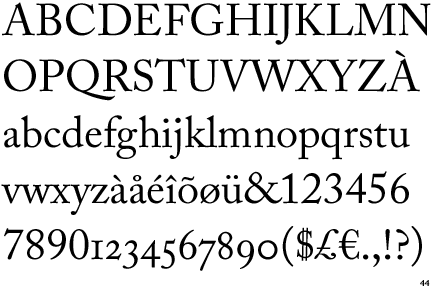
The other chapters feature Adobe Caslon, a font designed in 1990 by Carol Twombly. However, she did not create it herself. William Caslon made a group of fonts known as Caslon, the first design being in 1722. The font "became popular throughout Europe and the American colonies; printer Benjamin Franklin hardly used any other typeface. The first printings of the American Declaration of Independence and the Constitution were set in Caslon." Caslon Pro was modeled off of instances of Caslon that appeared between 1734 and 1770, so, in a way, it's still its own font, as it was created from taking inspiration from many different versions.

Sources:
http://www.identifont.com/samples/fountain/Mercury.gif
http://en.wikipedia.org/wiki/Jonathan_Hoefler
http://en.wikipedia.org/wiki/Caslon
http://store1.adobe.com/cfusion/store/html/index.cfm?event=displayFontPackage&code=1712
http://www.identifont.com/samples/adobe/AdobeCaslon.gif
The other chapters feature Adobe Caslon, a font designed in 1990 by Carol Twombly. However, she did not create it herself. William Caslon made a group of fonts known as Caslon, the first design being in 1722. The font "became popular throughout Europe and the American colonies; printer Benjamin Franklin hardly used any other typeface. The first printings of the American Declaration of Independence and the Constitution were set in Caslon." Caslon Pro was modeled off of instances of Caslon that appeared between 1734 and 1770, so, in a way, it's still its own font, as it was created from taking inspiration from many different versions.

Caslon doesn't have too many outright standout qualities, either. It's a pretty standard serif font, with just a few noticeable differences. For one, the top of the lowercase "f" sticks out farther and curves under less than in most fonts. It includes old-style numbers, so the 1,2, and 0 all fit within the x-height. The 1, actually, is another unique feature, looking almost like an uppercase "I," while the 0 is oddly round, appearing almost like an "o". However, these aspects just make the font what it is, and obviously that works, as the New Yorker utilizes the font for its content.
I could go on a lot more about both of these fonts, discussing how the leading is probably about at 1.5 in the book, which is pretty standard for a novel, as it eases reading. Single-spacing can appear cramped. Ironically, this entire blog is single-spaced, but it also incorporates pictures and double spacing between the paragraphs to give the eyes a periodic break. But, they'll also get an even longer break, as this is where I'm leaving off.
I could go on a lot more about both of these fonts, discussing how the leading is probably about at 1.5 in the book, which is pretty standard for a novel, as it eases reading. Single-spacing can appear cramped. Ironically, this entire blog is single-spaced, but it also incorporates pictures and double spacing between the paragraphs to give the eyes a periodic break. But, they'll also get an even longer break, as this is where I'm leaving off.
Sources:
http://www.identifont.com/samples/fountain/Mercury.gif
http://en.wikipedia.org/wiki/Jonathan_Hoefler
http://en.wikipedia.org/wiki/Caslon
http://store1.adobe.com/cfusion/store/html/index.cfm?event=displayFontPackage&code=1712
http://www.identifont.com/samples/adobe/AdobeCaslon.gif
No comments:
Post a Comment